
OVERVIEW
A storytelling and safe-space atelier reimagining work, power and possibility for Black women.


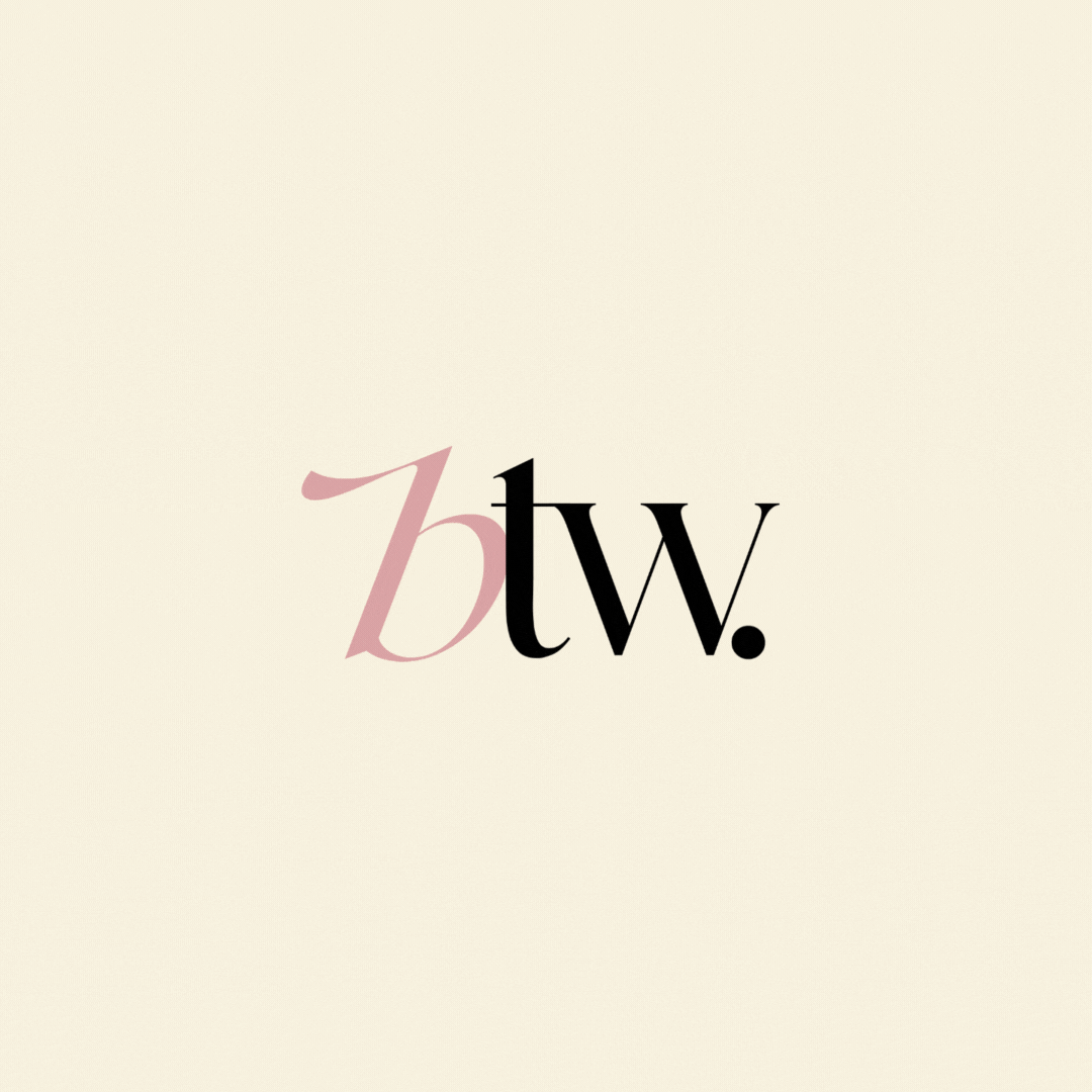
The BTW logo embodies an editorial, chic, and feminine aesthetic—reflecting the brand’s mission to build an empowering community for Black women navigating corporate spaces. The bold black serif letters “T” and “W” convey strength and professionalism, while the soft, sweeping blush-pink “B” adds a sense of elegance, fluidity, and warmth. This balance of structure and softness visually represents the duality of resilience and grace that defines the community.


The Universe
To support BTW’s growing ecosystem, we developed a series of sub-logos for each of the brand’s core initiatives—designed to visually unify the broader mission while giving each program its own distinct presence. These include the BTW podcast, IRL events, a private text-based community, and a forthcoming professional development curriculum aimed at helping companies retain, respect, and resource Black women. Each sub-logo maintains a cohesive visual language while allowing for flexibility across mediums and platforms, reinforcing BTW’s identity as both a community and a catalyst for lasting change in the corporate world.
C:13%
M:40%
Y:25%
K:0%
R:210
G:163
B:165
#daa3a5
C:22%
M:94%
Y:100%
K:15%
R:172
G:47
B:26
#ac2f1a
C:2%
M:3%
Y:12%
K:0%
R:247
G:241
B:223
#f7f1df
C:75%
M:68%
Y:67%
K:90%
R:0
G:0
B:0
#000000


